Adaptive and Flexible Website Design
Responsive Web Design
Your Site / Multiple Solutions

In the field of Web design and development, we’re quickly getting to the point of being unable to keep up with the endless new resolutions and devices. For many websites, creating a website version for each resolution and new device would be impossible, or at least impractical. Should we just suffer the consequences of losing visitors from one device, for the benefit of gaining visitors from another? Or is there another option?
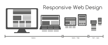
Responsive Web design is the approach that suggests that design and development should respond to the user’s behavior and environment based on screen size, platform and orientation. The practice consists of a mix of flexible grids and layouts, images and an intelligent use of CSS media queries. As the user switches from their laptop to iPad, the website should automatically switch to accommodate for resolution, image size and scripting abilities. In other words, the website should have the technology to automatically respond to the user’s preferences. This would eliminate the need for a different design and development phase for each new gadget on the market.
“Recently, an emergent discipline called “responsive architecture” has begun asking how physical spaces can respond to the presence of people passing through them. Through a combination of embedded robotics and tensile materials, architects are experimenting with art installations and wall structures that bend, flex, and expand as crowds approach them. Motion sensors can be paired with climate control systems to adjust a room’s temperature and ambient lighting as it fills with people. Companies have already produced “smart glass technology” that can automatically become opaque when a room’s occupants reach a certain density threshold, giving them an additional layer of privacy.”
Transplant this discipline onto Web design, and we have a similar yet whole new idea. Why should we create a custom Web design for each group of users; after all, architects don’t design a building for each group size and type that passes through it? Like responsive architecture, Web design should automatically adjust. It shouldn’t require countless custom-made solutions for each new category of users.
Obviously, we can’t use motion sensors and robotics to accomplish this the way a building would. Responsive Web design requires a more abstract way of thinking. However, some ideas are already being practiced: fluid layouts, media queries and scripts that can reformat Web pages and mark-up effortlessly (or automatically).
But responsive Web design is not only about adjustable screen resolutions and automatically resizable images, but rather about a whole new way of thinking about design. Let’s talk about all of these features, plus additional ideas in the making.
Got Questions
Free Professional Consultation One on One Short Meeting Free Advice
PCMG’s Marketing is recognized as one of the top Dallas SEO Companies that specializes in small to mid-size businesses.
Simply put, our goal is to enable internet searchers to find your site using a variety of techniques including keyword optimization and various geo-targeting methods.
Our Services
Select a View
With more devices come varying screen resolutions, definitions and orientations. New devices with new screen sizes are being developed every day, and each of these devices may be able to handle variations in size, functionality and even color. Some are in landscape, others in portrait, still others even completely square. As we know from the rising popularity of the iPhone, iPad and advanced smartphones, many new devices are able to switch from portrait to landscape at the user’s whim. How is one to design for these situations?

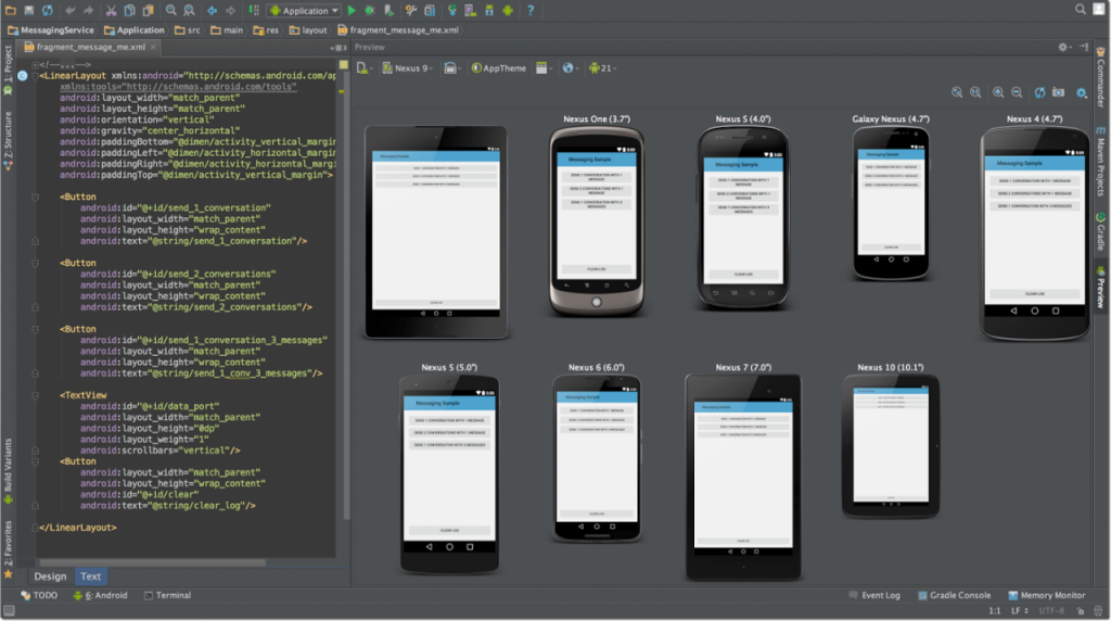
In addition to designing for both landscape and portrait (and enabling those orientations to possibly switch in an instant upon page load), we must consider the hundreds of different screen sizes. Yes, it is possible to group them into major categories, design for each of them, and make each design as flexible as necessary. But that can be overwhelming, and who knows what the usage figures will be in five years? Besides, many users do not maximize their browsers, which itself leaves far too much room for variety among screen sizes.

Morten Hjerde and a few of his colleagues identified statistics on about 400 devices sold between 2005 and 2008. Below are some of the most common:
Since then even more devices have come out. It’s obvious that we can’t keep creating custom solutions for each one. So, how do we deal with the situation?

